Itque Brochure
Overview
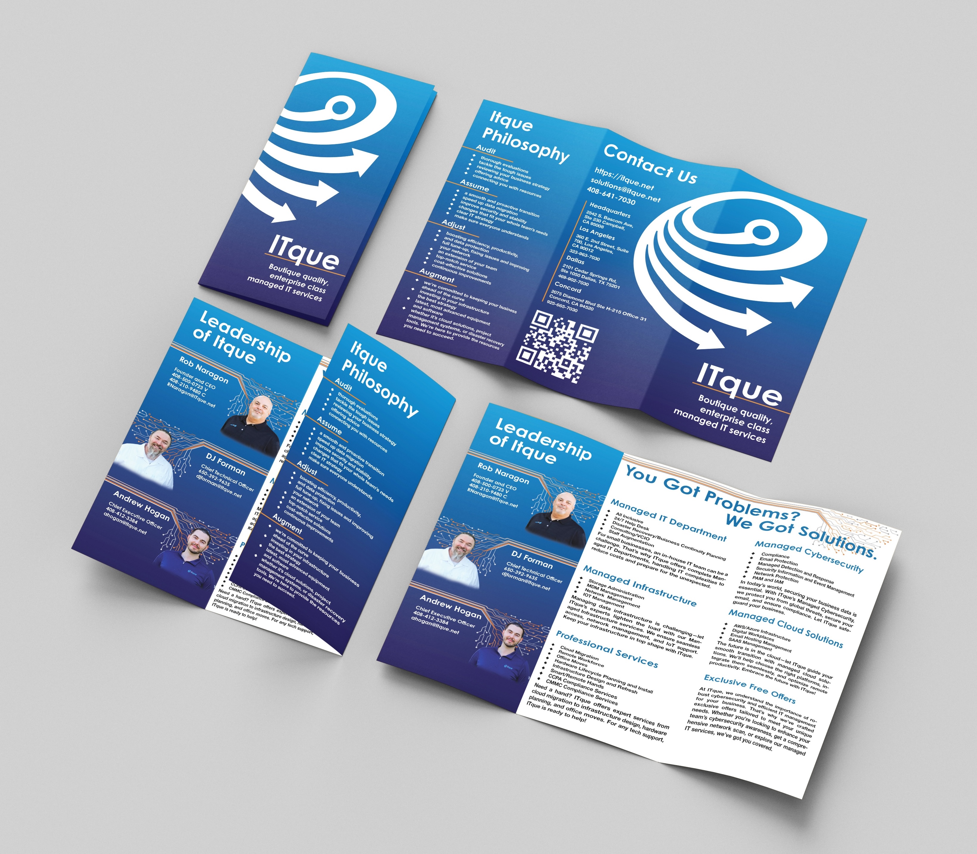
This tri-fold brochure was voluntarily created for ITque, an IT services company, to provide potential clients with a clear, concise overview of their offerings, values, and leadership. The goal was to design a professional, approachable piece that aligns with ITque’s brand identity and conveys their expertise.
Objective
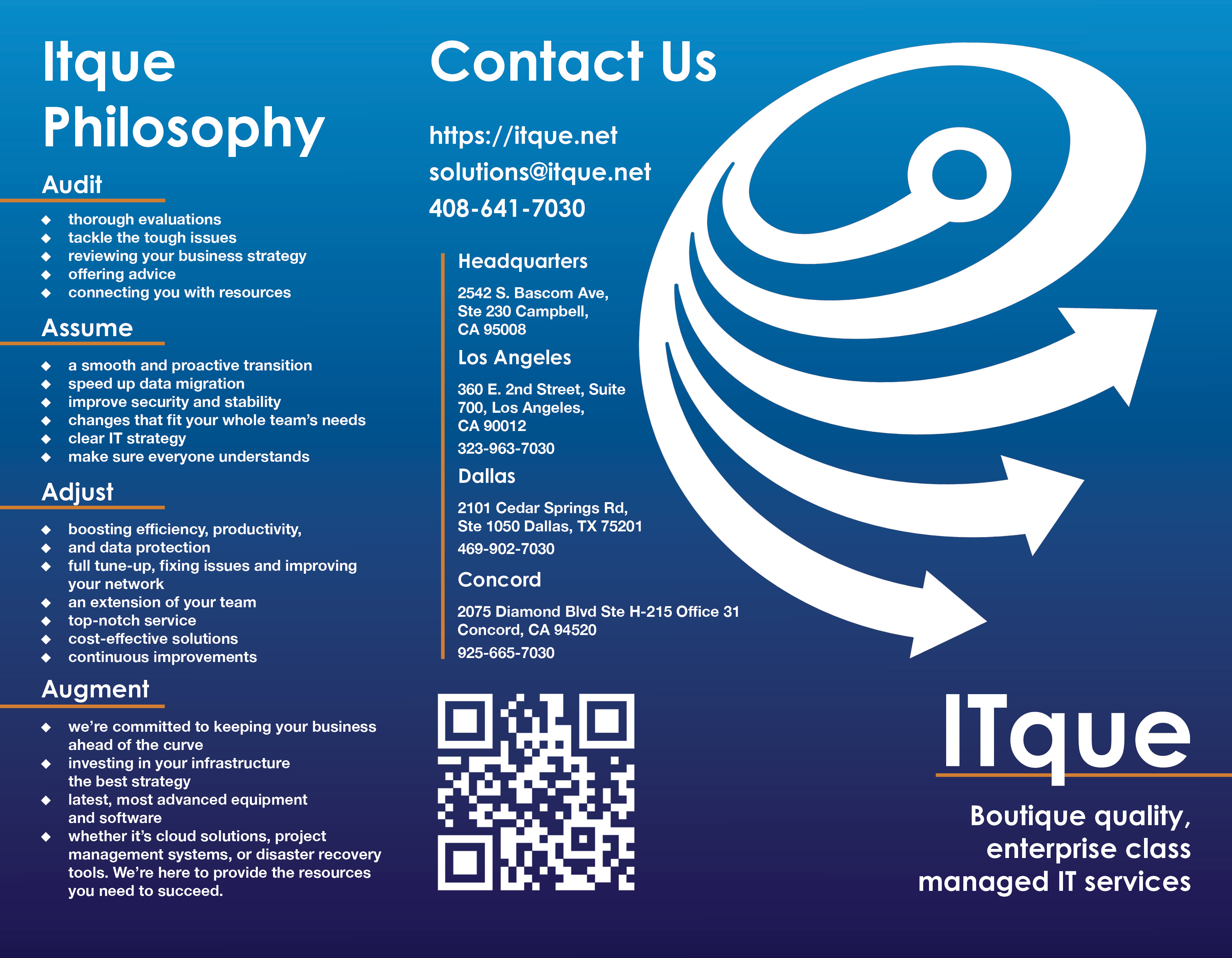
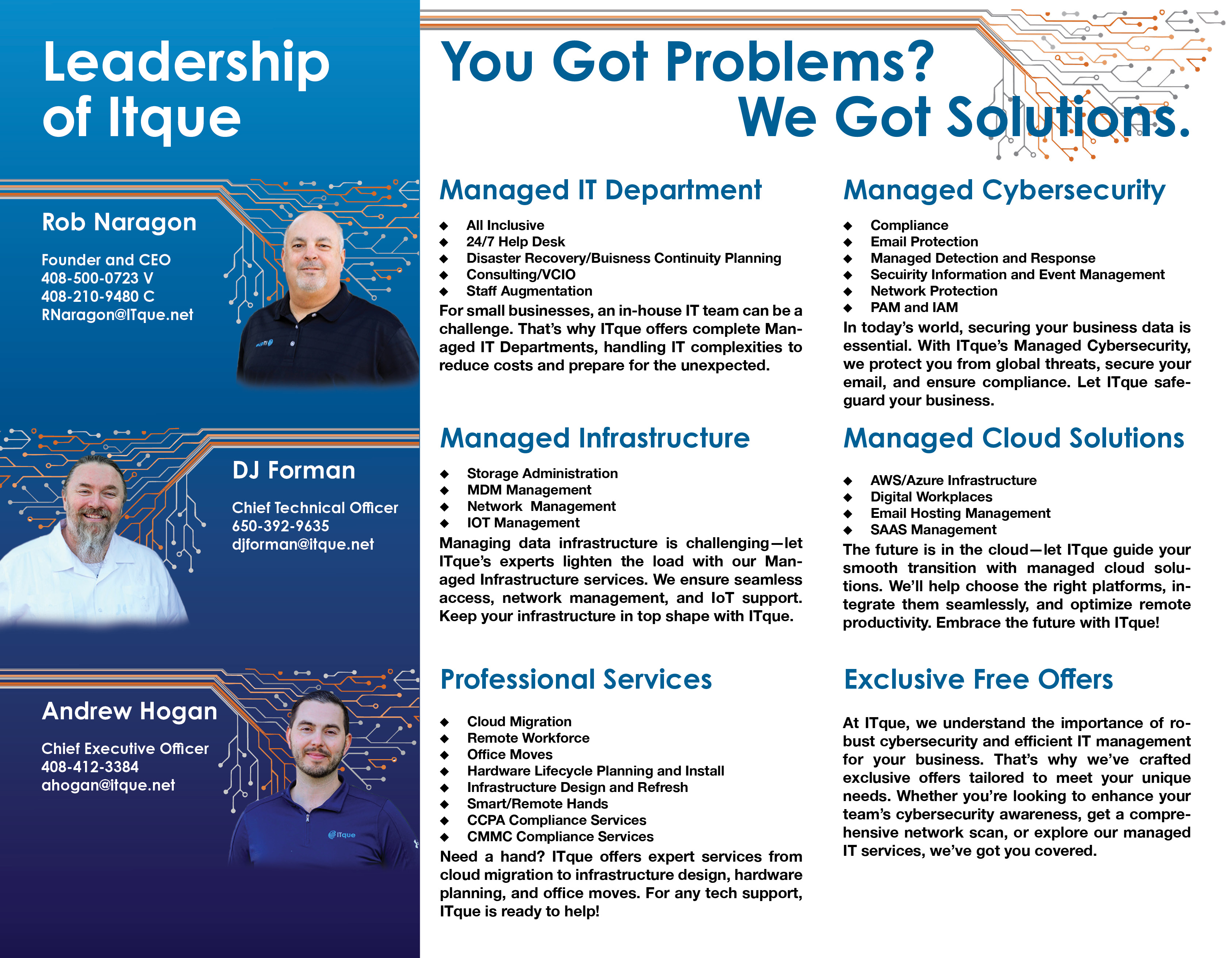
The primary objective was to present ITque’s services and corporate philosophy in an organized, visually appealing manner. The brochure’s design concept was inspired by a clean, modern aesthetic that communicates reliability and innovation, helping ITque make a strong impression in a competitive industry. The theme of directional arrows and technology-inspired graphics underscores ITque's commitment to guiding clients toward effective IT solutions.
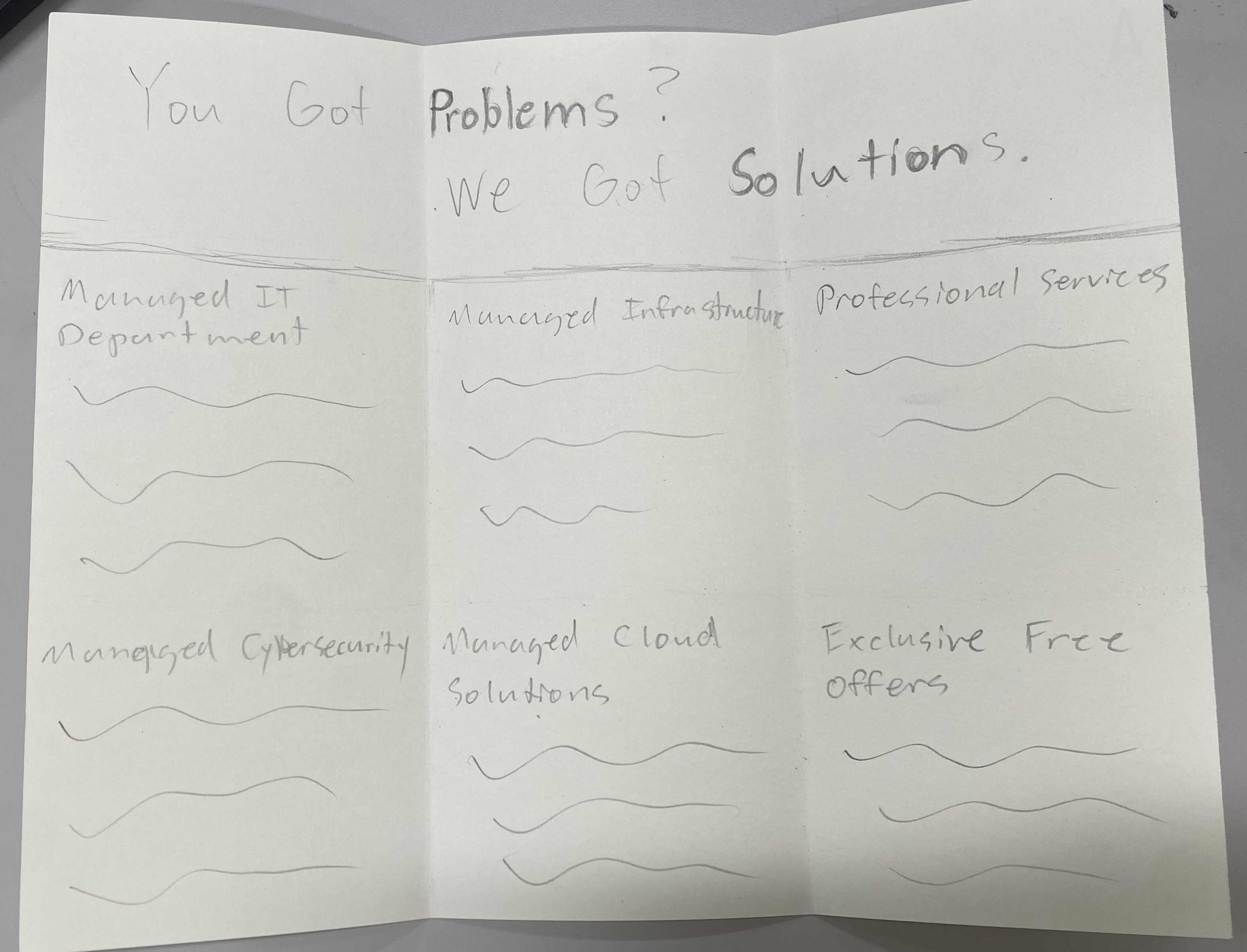
Process
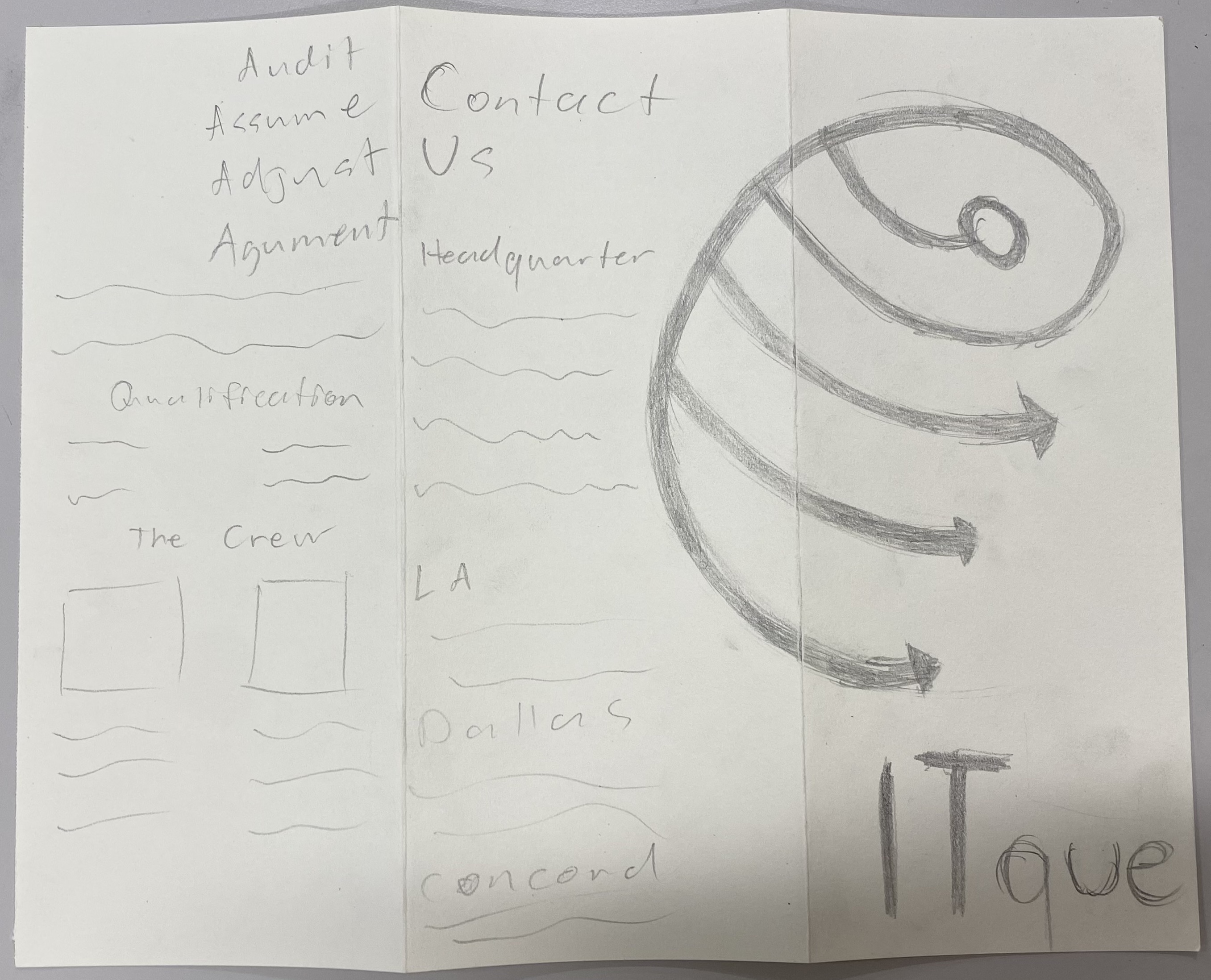
I structured the brochure with sections for services, leadership, philosophy, and contact details, prioritizing readability and flow. I incorporated gradients, bold icons, and a cool blue color palette with grey, orange and white accents. Their style guide was very minimal only including blue, grey, and one type font with no other information. I added other accent colors such as the orange and a secondary typeface to aid in adding more depth to their brand identity. The orange helps to modernize their brand and the second typeface is more legible for large sections of text. I used their website to capture assets and as further guidance on layout and style to create a technology-forward, cohesive look. Balancing a lot of information in a small space was challenging; I used visual hierarchy techniques to make the layout clear and accessible while ensuring a proper amount of negative space so as to not overwhelm the viewer.

Outcome
The final brochure is visually engaging and well-organized, effectively highlighting ITque’s strengths and services. ITque has expressed further interest in the design and wishes to expand the design to other aspects of their brand identity such as updating their website.
Personal Touch
I enjoyed exploring how design can convey expertise and trustworthiness, especially for a technical field. This project taught me a lot about balancing text and visuals to keep technical content appealing and easy to digest. The opportunity to design within a more professional context was invaluable.