Marian Bantjes Magazine Spread
 (2).jpg)
Overview
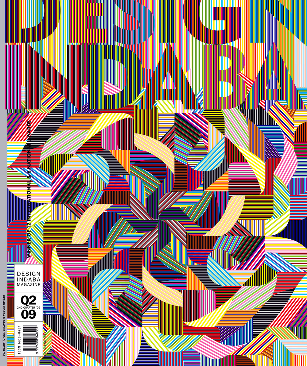
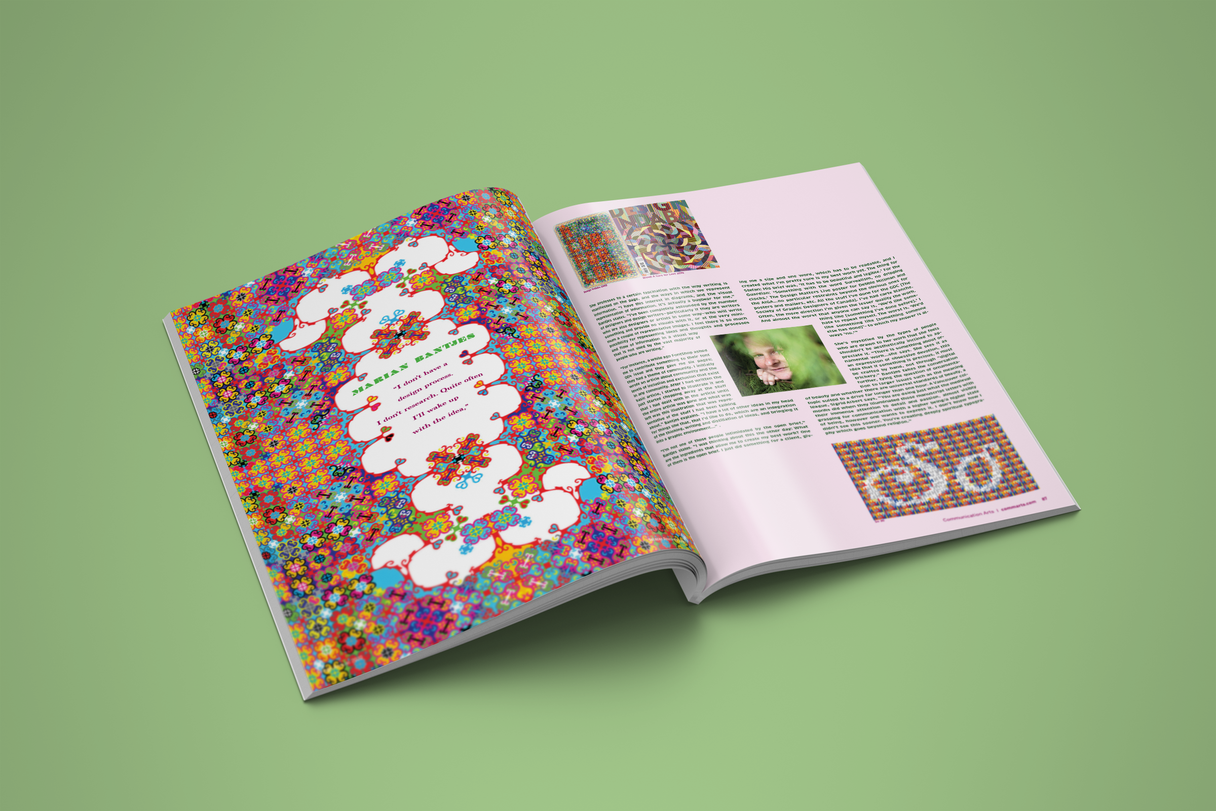
This magazine spread was designed for a mock feature article on the graphic designer Marian Bantjes who’s known for her ornate and maximalist typography and patterns.
Objective
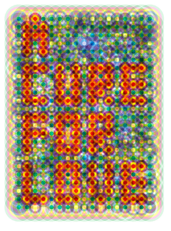
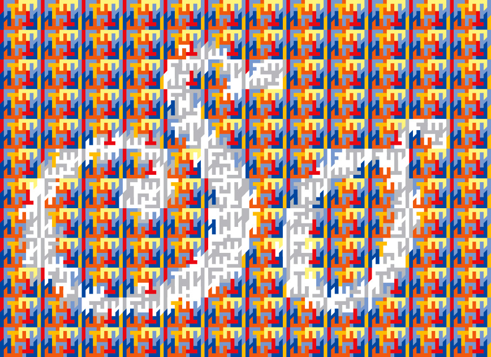
This magazine spread is meant to exhibit her work and convey the sense of whimsy in Bantjes’ work through the layout. This was done by featuring her pieces boldly, most obviously on the first page. The spread features some of her notable patterns and typography as well as featuring them in a layout that persuades the reader’s eyes to view the whole spread.
Personal Touch
I enjoyed the creative challenge of translating the artist’s abstract work into a functional layout, learning new techniques for integrating complex visuals without compromising readability.
Process
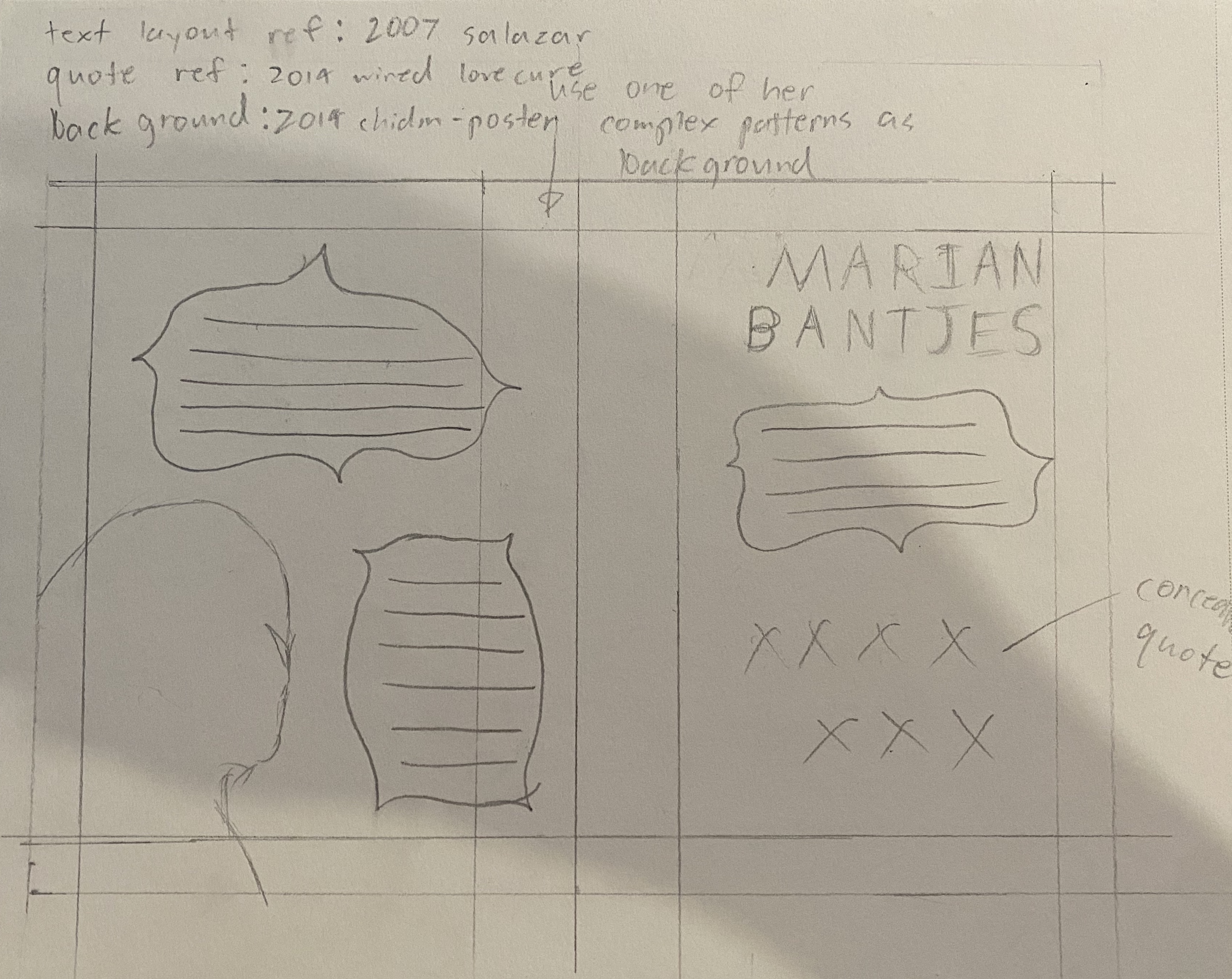
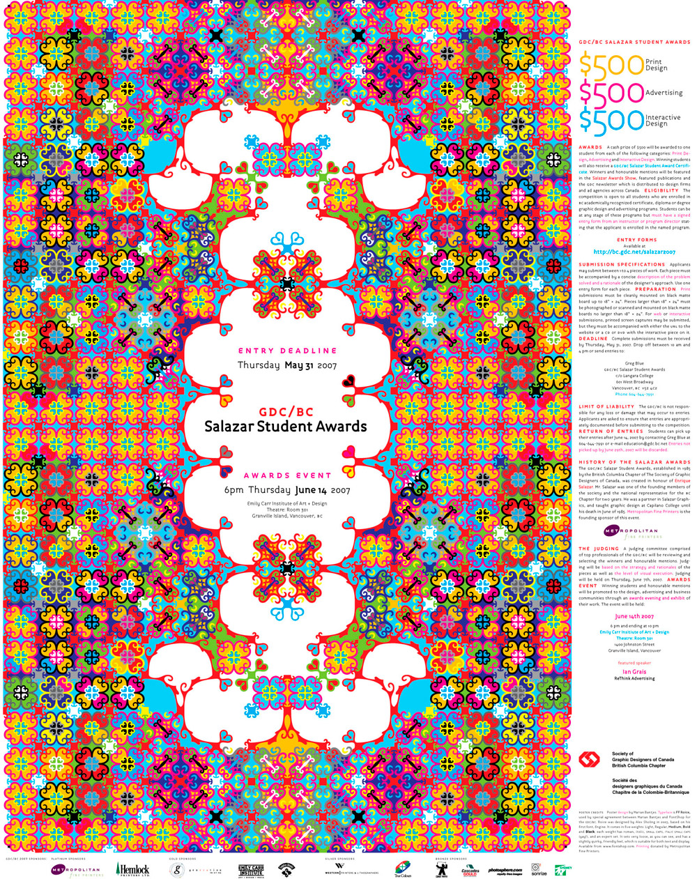
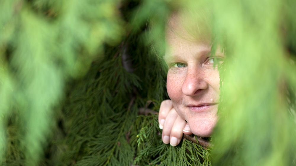
This project was challenging as I struggled to identify the line between inspiration and copying, especially since Bantjes’ style has similar aspects to my own. I went through many iterations and at one point received a critique stating I had completely missed the mark. This served as a clarifying moment and allowed me to meld my style with Marian Bantjes. I used one of the posters she had designed as the title page on the left side of the spread replacing the text with the article title and a quote from her. From there I used a 4x4 grid system on the right page of the spread making the images of Bantjes’ work occupy the top left and bottom right corners and the text filling the center section. As well as that I place a picture of Bantjes peeking out of some bushes in the middle of the text, adding the playful effect of her seemingly peeking out of the text as well. Arranging her picture in the center also created a diagonal line connecting all the images from top left to bottom right creating a visual flow that parallels the typical western reading flow of going from top left to bottom right.
Outcome
The final spread is engaging and visually aligned with the artist’s aesthetic, successfully drawing readers into the article. Feedback was positive, noting that the design’s boldness made the article more inviting and memorable.